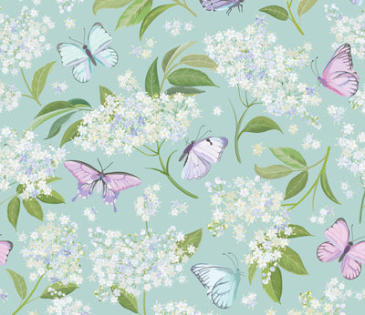
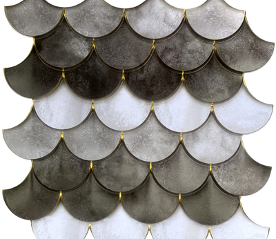


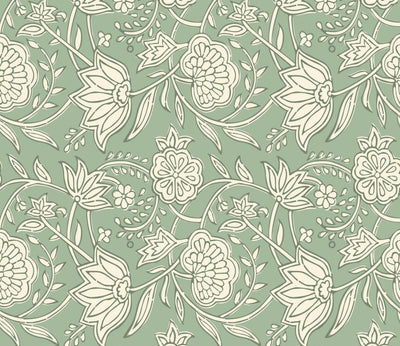
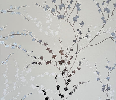

Floral Circles peel and stick wallpaper applied to the front doors of a wood sideboard — cabinet refacing DIY
MS Creations

Peel and Stick Wallpaper on Cabinets: A Renter's DIY Refacing Guide

Main Street8 MIN READ

Your cabinets are probably the largest surface in your kitchen, and in most rentals they are also the one thing you are stuck with. Putting peel and stick wallpaper on cabinets is one of the fastest ways to give tired fronts a whole new finish without a sander, a paint sprayer, or a single conversation with your landlord. Done with a little care, it is removable, deposit-safe, and surprisingly forgiving for a first project.

This guide is about cabinets and built-ins specifically: kitchen uppers and lowers, a bathroom vanity, a laundry-room cupboard. If you want to wrap a loose dresser or nightstand, the technique overlaps but the prep differs, so head to our guide to wallpapering loose furniture for that. Here, we are focused on the fixed stuff you do not own.

Can you really wallpaper kitchen cabinets?

Yes, and it is one of the smartest renter moves there is. Cabinet boxes and doors are flat, rigid, and predictable, which is exactly what self-adhesive material likes. The question is rarely can you and more often which surface are you working with. Some cabinet faces are a dream to wrap. Others fight back.

Surfaces that work well

  • Laminate and melamine — Smooth, sealed, and slightly glossy. These are the ideal candidates. The factory finish gives the adhesive a clean, even surface to grab.
  • Painted cabinets — Fully cured paint (satin or semi-gloss) works beautifully. Fresh paint needs a few weeks to harden first, or the adhesive can pull it off later.
  • MDF and thermofoil — Dense, flat, and consistent. As long as the surface is intact and not peeling, it takes wallpaper readily.

Surfaces that need extra care

  • Raw or unfinished wood — Porous wood drinks up adhesive and grips it hard, which makes for a weaker initial bond and a messier removal. Seal it first if you can.
  • Heavily textured or deeply routed doors — Shaker fronts with a recessed center panel are doable; ornate, beveled, or wood-grain-textured doors are where things get tricky. The paper bridges grooves instead of sitting flush.
  • Glossy, never-cleaned fronts — Not impossible, just deceptive. The shine is usually a film of cooking grease, and grease is the number one reason cabinet wallpaper lifts.

If you are unsure, test a small, hidden area first, like the inside edge of a lower door, and live with it for a day before committing to the whole run.

Prep is everything (especially the degreasing part)

Walls forgive a quick wipe-down. Cabinets do not. Kitchen fronts collect an invisible layer of airborne grease, and bathroom and laundry cabinets collect humidity and dust. Skip this step and you will be back in our application troubleshooting within a week. For the full surface-prep rundown that applies to any project, see our notes on prepping surfaces before you stick.

The degrease-and-dry routine

  • Degrease thoroughly. Wipe every front and edge with a grease-cutting cleaner or a little dish soap in warm water. For stubborn buildup near the stove, a 50/50 vinegar-and-water pass helps.
  • Rinse and dry completely. Any residue, including cleaner residue, sits between the adhesive and the cabinet. Follow with a clean-water wipe, then let everything dry fully.
  • Scuff the gloss, gently. On very shiny laminate, a light pass with a fine sanding sponge dulls the surface so the adhesive has something to hold. You are not removing the finish, just taking the slip off it.
  • Work warm. Adhesive is happiest at room temperature. A cold garage cabinet in winter is a tough customer; let the space and the wallpaper acclimate before you start.

Remove the doors and hardware first

It is tempting to wrap the doors in place. Resist. Twenty minutes with a screwdriver makes the whole project cleaner, faster, and far more professional-looking.

  • Unscrew the doors at the hinges and label each one (a piece of tape on the back, numbered to its opening, saves a frustrating reassembly).
  • Take off knobs and pulls. Wrapping around hardware is fiddly and never looks intentional. Remove it, wrap the flat front, then poke the screw holes through and reattach.
  • Lay doors flat on a table or the floor. A horizontal surface lets you smooth from the center out without gravity working against you.

Working flat is the single biggest upgrade to your results. You get full control, no drips of tension, and clean wrapped edges.

Wrapping the door fronts and edges

This is where the technique matters. The goal is a tight, bubble-free face and edges that look finished rather than folded.

Step by step

  • Measure and cut with roughly an inch of overhang on every side so you have material to wrap around the edge.
  • Peel a few inches of backing, line up the top edge, and press. Then slowly peel the rest as you smooth downward with a felt-edged smoother or a credit card wrapped in a soft cloth.
  • Smooth from the center outward in a fan motion to push air toward the edges, not trap it in the middle.
  • Wrap the edges by folding the overhang around the side of the door. At the corners, trim a small notch so the paper folds flat instead of bunching, the same way you would wrap a gift box.
  • Seal the edges down firmly with your fingernail through a cloth or the smoother. Edges and corners are where lifting starts, so give them extra pressure.

For the boxes and any face frames, work in manageable sections and meet your seams at natural breaks where they will read as part of the cabinet line. The core smoothing technique is identical to wall installs, so lean on our step-by-step application guide if you want a deeper walk-through.

Choosing a look that suits the room

Cabinets are a big visual commitment, so the print does a lot of work. The good news is that a flat cabinet front is the perfect canvas for the kinds of finishes you would never get from a paint can.

For a clean, built-in feel

Stone and marble looks read as upscale and quiet, which is why they suit kitchens and vanities so well. A Carrara Marble peel and stick sheet gives lower cabinets the weight of stone without the cost or the contractor, and it pairs with almost any countertop. For a subtler texture, the warm neutral of a herringbone weave adds depth on a laundry-room cupboard without shouting.

For a bit of personality

If the cabinets are the moment, let them be the moment. The navy-and-brass geometry of Indigo Diamonds turns a plain bathroom vanity into something deliberate, while soft Eucalyptus sprigs bring a calm, botanical note to a powder-room cabinet. For an inset panel or a glass-front upper, the gray-and-white Floral Circles tiles add a graphic detail in a small, contained dose. Cabinets are design opportunities too, not just storage.

Because the material is PVC-free paper, it sits matte and natural rather than plasticky, more like the stock in your favorite art books than a vinyl wrap. Just check each product page for exact sheet and tile coverage so you order enough to wrap fronts, sides, and the inevitable practice piece.

Will it damage the cabinets? The renter's bottom line

This is the question that matters most when the cabinets are not yours, and the honest answer is: on a sound, sealed surface, removal is clean and low-drama. The adhesive is designed to come away without taking the finish with it, which is the whole point of choosing wallpaper over paint or contact-glue products.

  • Removal: Peel slowly at a low angle. A little warmth from a hair dryer softens the adhesive on stubborn spots and reduces any chance of pulling.
  • Where it gets risky: Raw wood and flaking old paint are the exceptions. If the surface itself is unstable, anything stuck to it can take a layer with it on removal, which is true of any adhesive, not just wallpaper.
  • Set expectations: It is removable, not invincible. Keep your labeled doors and leftover material so reversing the project at move-out is a quiet afternoon, not a deposit dispute.

No drills, no contractors, no compromises, and nothing your landlord needs to know about. That is the quiet advantage of refacing this way.

Frequently asked questions

Can you put peel and stick wallpaper on cabinets?

Yes. Cabinet fronts are flat and rigid, which makes them well suited to self-adhesive wallpaper. Laminate, melamine, MDF, and fully cured painted cabinets work best. Raw wood and heavily textured or routed doors are trickier. The key to a lasting result is thorough degreasing and a fully dry surface before you start.

Does peel and stick wallpaper damage cabinets?

On a sound, sealed surface, no. The adhesive is made to peel away cleanly without lifting the finish. Removal is easiest when you go slowly at a low angle, warming stubborn spots with a hair dryer. The exceptions are raw wood and flaking old paint, where an unstable surface can come away with anything stuck to it.

How do you apply peel and stick wallpaper to cabinet doors?

Remove the doors and hardware, then degrease and dry them thoroughly. Lay each door flat, cut your piece with about an inch of overhang, and peel the backing gradually as you smooth from the center outward. Wrap the overhang around the edges, notching the corners so they fold flat, and press the edges down firmly to prevent lifting.

Is wallpapering cabinets renter friendly?

Very. It is removable and, on the right surface, deposit-safe, which makes it one of the best ways to update a rental kitchen or bath without permanent changes. Save your labeled doors and any leftover wallpaper so you can reverse the look at move-out. Always test a hidden spot first if you are unsure about the surface.

MAIN STREET

Featured in this article

Shop the wallpapers mentioned above.

Learn & Inspire

Marble-print peel and stick paper covering the top of a low table, with a white tray, potted plants and a dark green sofa behind.
Posted By Main Street

Contact Paper on Countertops: How to Do It and What to Expect

A countertop is the largest surface in most kitchens and easily the most expensive one to replace. That gap is exactly why so many renters and first-time homeowners end up searching how to install contact paper on countertops instead of calling a fabricator. It is a genuine project with genuine results, and it also has failure points worth understanding before you unroll anything. What a papered counter can and cannot do Think of this as a cosmetic layer, not a resurfacing system. Self-adhesive paper grips smooth, sealed, non-porous surfaces, which makes laminate the friendliest substrate you can ask for. It will not repair anything structural. A chip, a burn mark, or a lifted seam in the original counter stays exactly where it is, and a thin covering tends to telegraph the damage rather than hide it. Sand nothing and fill nothing unless you are prepared to do that properly first. It is worth naming the honest part early: a kitchen counter is the hardest thing you can ask of adhesive paper anywhere in the house. It gets standing water, hot pans, blades, cleaning products, and appliances dragged across it several times a day. Every other contact paper project in your home is gentler than this one. That does not mean the project fails, but it does mean your prep and your edges matter far more here than they would on a shelf. How to install contact paper on countertops, step by step The sequence below assumes a standard run with a back wall and a drop-in sink. If you have never worked with self-adhesive paper before, our guide to applying contact paper without bubbles covers the core smoothing technique in more detail than we will repeat here. 1. Clean far harder than you think you need to Kitchen counters carry a fine film of cooking oil that you cannot see and adhesive cannot survive. A regular all-purpose spray is not always enough. Scrub the whole surface with a degreasing cleaner, rinse it, then let it dry completely before anything sticky touches it. Adhesive failure on counters is almost always a cleaning failure in disguise. 2. Template before you cut Roll the paper out across the counter and leave a few extra inches at every side rather than cutting to your measured number. Remember to include the front edge in your depth, plus enough to fold underneath. Cutting exactly to size is the single most common way people waste a roll. 3. Start in a back corner and work forward Line the long edge of the paper up with the back wall or backsplash, since that is the reference line every other cut will answer to. Peel back roughly six inches of the liner, press it down, and sweep your smoothing tool from the center outward before peeling the next six inches. Working in short sections is what keeps air from getting trapped in the middle of a large run. 4. Wrap the front edge Fold the overhang down and under like you are wrapping a gift, pressing it tight into the underside lip. On a rounded or bullnose edge, a hair dryer on low will warm the paper enough to relax it into the curve instead of tenting off it. Trim the excess underneath the lip with a sharp blade so the cut line never shows from standing height. 5. Leave the sink until last Cover the opening, then cut a rough hole a couple of inches inside the sink perimeter and make relief cuts out toward the corners. Fold the flaps down into the basin and trim against the rim. Change your blade before you start this cut. A dull blade drags and tears the paper exactly where you most need a clean line. Seams, edges, and where it lifts first Overlap seams by about a quarter inch rather than butting them together, and shingle them so water runs over the joint rather than into it. Give some thought to where a seam lands. Putting one directly under the coffee maker or the dish rack guarantees it takes the most abuse in the room, and DIY accounts of long-term counter installs consistently report that a seam under a frequently moved appliance is the first thing to wear through. Searches for how to seal contact paper on countertops usually lead to the same answer, and it is a reasonable one: a thin bead of clear silicone caulk along the back wall and around the sink rim keeps water out of the vulnerable edge, which is where nearly every failure starts. Two caveats. Caulk protects the perimeter, it does not turn the surface into something impervious. And it is a semi-permanent addition to a rental fixture, so check your lease before you run a bead of anything around the sink. Living with a papered counter Clean it with mild soap or a diluted vinegar solution and a soft cloth. Skip abrasive pads and scouring powders, which will dull and eventually score the printed face. Use a cutting board every single time, because a knife goes straight through paper and into whatever is underneath. Use a trivet as well, and never set a hot pan down directly. How long it lasts depends almost entirely on how hard the counter works. A guest bathroom vanity and a family kitchen island are not the same project, and you should expect wear to appear at seams, the sink perimeter, and the front edge long before the middle of the run shows anything at all. Treat it as a finish you will refresh rather than a permanent surface, and it tends to be a satisfying project. Expect it to behave like stone and it will disappoint you. When the day comes, our guide to removing contact paper covers the stuck-on cases, and our beginner's guide answers the broader material questions, including how contact paper handles water. Where Main Street paper belongs in this kitchen We will be straight with you, because the alternative is selling you a disappointment. Main Street's Classic Sheets are paper, they measure 11 by 16 inches, and every product page lists painted, sealed and finished surfaces as the intended use while specifically telling you to skip moisture and wet zones. A working counter beside a sink is a wet zone. Our sheets are not the right product for that run, and we would rather say so here than have you find out around the sink in month two. What our paper is genuinely good at is the dry vertical square footage surrounding that counter, which is usually the part people forget. The side panel of an island, the back of open shelving, or a dry stretch of wall takes Carrara Marble sheets beautifully, and the veining echoes a stone counter without asking paper to live next to running water. Stacked Stone does the same trick with more texture in the print. For a dry decorative stretch of wall, Marble Silver Hexagon tiles come 24 to a pack at 8 by 8 inches each, covering roughly 10.67 square feet. Cabinet and drawer fronts are the other easy win, and a pattern like Herringbone changes a kitchen faster than the counter does. We have a full walkthrough on refacing cabinets with peel and stick wallpaper if that is the direction you take. You will want a utility knife and a smoothing tool for any of it. Frequently asked questions How long does contact paper last on countertops? There is no single number, because it depends on traffic, water exposure, and how well the edges were sealed. A lightly used vanity holds up far longer than a busy family kitchen. Wear shows up first at seams, the sink perimeter, and the front edge, so inspect those spots rather than judging by the middle of the counter. Can you put contact paper on laminate countertops? Laminate is the best-case substrate for this project. It is smooth, sealed and non-porous, which is exactly what self-adhesive paper needs to grip. Degrease it thoroughly and let it dry completely first. Test an offcut in a hidden spot, such as under the front lip, before you commit to the whole run. Does contact paper ruin countertops? On sealed laminate, removal is usually uneventful, though old adhesive left in place for years gets progressively more stubborn. The risk rises sharply on porous, unsealed or previously damaged surfaces, where the adhesive has something to grab. Our guide on whether contact paper is removable breaks the outcome down surface by surface. Can you put contact paper on tile countertops? Tile is a problem, and the tile is not the reason. Grout lines sit lower than the tile face, so paper bridges the gaps rather than bonding into them, and those hollow channels become bubbles and tear lines within weeks. Skim the grout flush first, or choose a different treatment for a tiled counter. Do I need to seal the edges? Sealing is not required, but the edges are where failure begins, so it is the step most worth doing. A thin bead of clear silicone at the back wall and around the sink rim keeps water from creeping underneath. It protects the perimeter rather than the surface, and on a rental fixture it is worth checking your lease first.
Living room corner with a wall in vertical wood slat look peel and stick wallpaper, a dark green armchair, a round green side table and a framed green abstract artwork above herringbone wood flooring
Posted By Main Street

Faux Texture Wallpaper: Does Wood, Stone or Grasscloth Look Real?

Search for textured wallpaper peel and stick designs and you will find wood slats, stacked stone, grasscloth, concrete and brick, every one of them promising depth. The useful question is not whether the product photo looks good. It is whether the illusion holds up in your room, in your light, at the distance you actually stand. Textured wallpaper peel and stick means printed depth, not a raised surface Start with what Main Street publishes on its own product pages. Under Product Details, the finish reads "Smooth decorative wall paper," and the material reads "Peel and stick paper wallpaper." Nothing in that spec is embossed, flocked or sculpted. The grain in a wood slat design, the mortar line in a stone design, the slubby weave in a woven one: all of it is ink on a flat sheet. Said plainly, that sounds like a limitation. In practice it is just a different set of rules. A real slat wall has physical edges that throw their own shadows, and those shadows travel across the day as the sun does. A printed slat wall carries shadows that were fixed in place the moment the original was photographed. They never move again. Whether your eye objects to that comes down to light, scale and seams, in roughly that order. Founder Jan McCallum trained as an oil painter, and painters spend entire careers on this exact problem: persuading a flat surface to read as depth. The craft is real. It just has conditions. Light decides more than the print does Conservators have a name for the technique that exposes a flat surface: raking light. Put a lamp close to a wall at a shallow angle, and genuine relief throws long shadows while a printed image sits there evenly lit. You already own the domestic version. A picture light angled down the wall, a sconce mounted tight against it, a low sun coming through a west window at four in the afternoon: each one is a raking light, and each one asks your printed texture a hard question. Diffuse light does the opposite. Bounced ceiling light, a north-facing window, a shaded lamp across the room, all of it softens real texture and printed texture more or less equally, which puts the two on even footing. So the placement rule is refreshingly simple. Give faux texture the walls where light arrives soft and frontal, and think twice about the one your track lighting grazes. It is also why the same design can be completely convincing in a bedroom and slightly off in a hallway. Nothing changed about the paper. Scale is the second tell, and an 11 x 16 in sheet sets the terms Main Street's Classic Sheets measure 11 x 16 in and cover 1.22 sq ft each, with roughly 14.6 sq ft in a 12-pack. Hold that against the thing being imitated and the arithmetic gets interesting. A standard brick runs about 8 in long, so one sheet holds barely two courses. A grasscloth weave repeats every fraction of an inch, so one sheet holds hundreds. Textures whose natural unit is small relative to the sheet read as continuous material. Textures whose natural unit is large relative to the sheet read as a pattern of individual objects, and objects invite counting. The moment a visitor starts counting bricks, they have stopped seeing a wall and started seeing wallpaper. Fine, irregular, small-repeat textures are simply carrying less risk. When you get to pack counts, our measuring guide handles the square footage side of the job. The textures that hold up, and the ones that fight you Sort faux textures by how deep the real material's relief is, and a fairly reliable ranking appears. Forgiving: shallow and irregular Grasscloth, linen, limewash, plaster, concrete and marble all share a useful quality. Their real-world relief is shallow, and its pattern is random. Shallow relief casts short shadows even in raking light, so there is less for a print to fail to reproduce, and randomness means your eye has no grid to check the reproduction against. A woven design like Silver Weave or the quieter Woven Stripe works this way, and stone veining does the same thing at a larger scale, which is why Carrara Marble survives close inspection on a shelf back or a drawer front where a brick print would not. Middle ground: linear and directional Wood slats, planks and shiplap sit in between. The relief is real but regular, and a good print reproduces the rhythm convincingly because the rhythm is most of the effect. Wood Slat Panel reads best viewed straight on across a room, where the vertical cadence does the work. Get very close, or light it from one side, and the flatness announces itself. Judge it from the sofa, not from six inches away. Hardest: deep and modular Beadboard, tumbled brick and stacked stone are the tough cases, because their whole character is deep relief arranged on a visible grid. A flat print has to fake both the shadow and the module. That does not make them unusable, it makes them distance-dependent. Stacked Stone is genuinely handsome given a full wall and standing room, where the eye takes in the overall field rather than auditing individual stones. Put the same design behind a desk where someone sits eighteen inches away, and you have asked too much of it. Seams are where a fake plank gets caught Nothing gives away a printed texture faster than a joint that lands somewhere the real material would never have one. Real planks run continuously; real stone courses stagger. A seam that cuts a printed plank in half mid-run is a discontinuity your brain flags before you can articulate why. Two habits fix most of this. First, plan the repeat before you cut anything, so the pattern carries across the join rather than restarting at it. Second, wherever the design has its own vertical lines, put the seam in one of them. On a slat print, a seam hidden inside a printed groove is essentially invisible. On a marble print, a seam through a vein is far kinder than one through open white field. The step-by-step application guide covers the smoothing tool and utility knife work that gets you a tight join. Tile-look designs follow their own logic, since a grid is the point rather than a problem. That case gets its own treatment in our guide to wallpaper that looks like tile. Placing it so the eye stays generous Main Street lists smooth tile, sealed wood and clean painted drywall as the best surfaces, and asks you to avoid ceilings, popcorn or rough drywall, brick or stone walls, and anywhere exposed to moisture such as bathrooms, showers and wet zones. Those limits are about how well the adhesive grips, and they apply no matter how good the print is. Beyond adhesion, favor the places where faux texture is doing scene-setting rather than material-claiming. A shelf back, a drawer front, an alcove, the wall behind a bed: all of these are viewed as backdrop, and backdrops get graded generously. The one place to be careful is anywhere a guest's hand naturally lands, like the wall beside a light switch, because touch settles the question instantly and permanently. If the wall itself already has a texture, that is a different problem with a different answer, and we wrote it up separately in our guide on applying peel and stick wallpaper over rough and popcorn surfaces. Frequently asked questions Does peel and stick wallpaper look realistic? Often, yes, though it depends on the texture and the setting. Fine, irregular textures such as woven, plaster and marble read convincingly even up close. Deep, modular textures such as brick and stacked stone are convincing from across a room and less so from arm's length. Soft frontal light helps in every case; strong side light works against you. Is there peel and stick beadboard wallpaper? Beadboard prints exist as a category, though Main Street's sheet range does not currently include one. Worth knowing before you shop: beadboard is among the hardest textures to fake, because its identity is a deep, evenly spaced groove that casts a real shadow. A flat print of it tends to hold up only in soft, even light. Does faux grasscloth wallpaper feel textured? Not on Main Street sheets. The product pages list the finish as "Smooth decorative wall paper," so the weave is printed rather than raised, and it feels like paper under your fingers. Visually it is one of the most convincing faux textures available, since real grasscloth has shallow relief and a random pattern that a good print reproduces well. Can you put textured wallpaper on a wall that is already textured? That is a question about adhesion rather than appearance, and the answer is usually no. Main Street lists textured drywall, popcorn finishes, brick and stone among the surfaces to avoid, because the adhesive needs a smooth base to grip properly. Our guide to rough and popcorn surfaces walks through the workarounds and their limits. Which faux texture is easiest for a first project? A woven or marble design on a small surface. Both have irregular patterns, so a slightly imperfect seam disappears rather than announcing itself, and neither depends on deep shadow to read correctly. A shelf back or a set of drawer fronts gives you a forgiving first run before you take on a whole wall.
A white sideboard with drawer fronts and cabinet doors covered in navy and gold geometric peel and stick paper, with books and a lidded jar on top.
Posted By Main Street

Can You Paint Over Contact Paper or Peel and Stick Wallpaper?

Can you paint over contact paper? Technically, yes. Whether you should is the better question, and the answer turns on something most tutorials skip past: you are asking paint to bond to a surface that was manufactured to be sealed, slick and non-porous. That is close to the opposite of what paint wants underneath it. So here is the honest version, including the prep that makes it work, the three ways it goes wrong, and the two routes that hold up better. Can you paint contact paper? Yes, but the prep is the entire job A painted contact paper surface can look fine for a long time. The catch is that almost none of that outcome comes from the paint you choose. It comes from what you do before the paint. Ordinary latex or oil paint straight from the can will not grip a printed adhesive covering well. Painters who get durable results on slick surfaces reach for a bonding or adhesion-promoting primer, sometimes sold as a stain-blocking primer-sealer, specifically one rated for plastic and other non-porous substrates. That primer is doing the real work. The topcoat is just color riding on it. Two prep notes that matter more than they sound: Clean first, seriously. Primers fail over dust, kitchen grease and hand oils, and a drawer front or shelf has all three. Wash, let it dry completely, and do not start priming a surface you have not degreased. Go easy on sanding. A light scuff gives primer something to hold, but contact paper is thin. Press too hard and you will scratch through the print or tear the sheet outright, and now you are patching instead of painting. Worth saying plainly: Main Street does not publish paint guidance for its papers, and nothing here is a tested specification from us. It is general practice for painting slick, sealed surfaces. Test a hidden corner before you commit to a whole cabinet run. Why paint struggles on a printed, sealed surface Paint holds through mechanical grip. It needs somewhere microscopic to sink into, which is why bare drywall and raw wood take paint so willingly and why glass does not. The face of a contact paper or a peel and stick sheet is the opposite of porous by design. It is printed and finished to shed marks and wipe clean, so a coat of paint sits on top of it rather than in it. It dries at the surface, stays brittle underneath, and then cracks or chips at the first point of flex. Which is why this fails fastest exactly where people most want to try it. Drawer fronts get yanked. Cabinet doors get knocked. A hollow-core door flexes every time it shuts. Those are high-contact surfaces, and a coating with no real bond does not survive contact. Spray, acrylic or latex: what each one does here Spray paint lays down thinner coats and carries less water, which sounds like an advantage. The trade-off is solvent. Some spray formulas can react with the adhesive layer or creep into seams and soften the glue holding everything down, so you lose the paper while gaining a paint job. Acrylic craft paint is the most commonly recommended option for small pieces, and adding a flow or adhesion medium improves how it lays down. It still needs primer under it if you want more than a decorative finish on something that never gets touched. Latex wall paint is the riskiest of the three on adhesive-backed material, for a reason that is easy to miss. Water-based products can re-wet the adhesive at the edges, and latex builds surface tension as it cures. That tension pulls, steadily, on a covering that was only ever held down by pressure. Paint that dries beautifully on a Tuesday can be lifting at the corners by the weekend. Seams and edges will give you away No paint hides a seam. Every butt joint and overlap telegraphs through, and painting often makes it more obvious rather than less: the pattern that was quietly camouflaging that line is now a single flat color, and flat color shows every ridge. The related rule is firmer. Do not paint over a covering that is already bubbled or lifting. You are not fixing the defect, you are sealing it in place and adding weight to it. If edges are lifting, deal with that first, or accept that the paint is going to peel away in sheets with the paper still attached. Our guide to bubbles, lifting and corners covers the repairs worth making. Painting over contact paper residue This is the one version of the question where the answer leans toward no. Old adhesive left behind after a covering comes off stays slightly tacky, and paint applied over tack tends not to cure properly. It stays soft, holds fingerprints, grabs dust out of the air and turns gray along the edges. Sealing residue under primer sometimes works and sometimes produces a gummy layer you have to strip twice. Take the residue off first. Warmth from a hair dryer softens aged adhesive, then a citrus-based adhesive remover or rubbing alcohol on a cloth lifts it in sections. Rinse, let the surface dry fully, then prime. What removal does to the surface underneath depends heavily on what that surface is, and our removal and residue guide breaks it down surface by surface. The routes that actually hold: strip it, or cover it again If the goal is paint, remove the covering and paint the real substrate. Stripping first gives you wood, laminate or drywall, all of which paint was formulated for, and you get a finish that lasts years instead of months. Start with how to remove contact paper for furniture, shelves and drawers, or how to remove peel and stick wallpaper for wall runs. If the goal was really just a different look, recovering is the faster answer. Peeling off tired paper and applying fresh paper over a cleaned surface is an afternoon with a utility knife and a smoothing tool, with no primer, no drop cloths, no ventilation problem and no waiting for anything to cure. A neutral like Herringbone reads as texture rather than pattern on cabinet fronts, and something like Eucalyptus does the job where you want the surface to feel lighter. Both are paper sheets meant for painted, sealed and finished surfaces, so the same smooth, dry, degreased prep applies. And if the reason you wanted to paint was function rather than color, skip the paint entirely. People search for whether they can put chalkboard paint or dry erase paint over contact paper, when a ready-made writable surface does it without the cure time. Chalkboard Classic and Dry Erase Classic are 11 by 15 inch peel and stick craft papers that write and erase with chalk and chalk markers, and with dry erase markers, respectively. Both are meant for painted and finished surfaces, which is exactly where a paint version would have been going anyway. Frequently asked questions Can you paint contact paper with acrylic paint? Acrylic is the most workable choice on small pieces, and a flow or adhesion medium helps it lay down evenly. It will still sit on the surface rather than bond into it, so use a bonding primer underneath and keep it to items that are decorative rather than handled daily. Test a hidden corner first. Can you spray paint contact paper? You can, and thin coats help, but spray carries a specific risk: solvents in some formulas soften adhesive and can creep into seams, releasing the covering you just painted. Prime with a product rated for slick surfaces, spray in light passes rather than one wet coat, and keep spray away from any edge that is already lifting. Can you paint over contact paper with chalkboard paint? It is possible with a bonding primer, but you inherit every problem above plus a long cure before you can write on it. A purpose-made chalkboard surface avoids that entirely. If the covering underneath is old or lifting, take it off first rather than adding a heavy, slow-curing coating on top of a weak bond. Can you paint over contact paper residue? Better not to. Residue stays tacky, and paint over tack often refuses to cure properly, staying soft and collecting dust and fingerprints. Soften the adhesive with gentle heat, lift it with a citrus-based remover or rubbing alcohol, rinse, and let the surface dry completely. Then prime and paint a clean substrate instead. Do I need to remove contact paper before painting a wall? For a wall you plan to keep painted, yes. Removing it gives paint the drywall surface it was designed for, and you avoid seams telegraphing through your finish. One timing note in the other direction: if you have just painted and want to apply paper over it, Main Street asks you to wait at least four weeks before applying.
A wood desk and houndstooth chair below blue and tan striped wallpaper set inside crisp white wall trim.
Posted By Main Streetwallpaper sheets

Peel and Stick Wallpaper Borders: Cut Your Own From Sheets

Search for peel and stick wallpaper borders and most of what comes back is a pre-printed roll in one fixed height. That is an odd constraint for a decorative band that has to suit your door casing, your shelf, your ceiling line. Cut your own from sheets and the constraint goes away: you pick the height, the run and the pattern, and you stop wherever the room says stop. Why cut your own peel and stick wallpaper borders A border is a strip. Nothing more mysterious than that. Main Street's Classic Sheets arrive as flat 11 in x 16 in rectangles, so the band you end up with is whatever you decide to cut out of that rectangle: a slim two-inch pinstripe under the ceiling, a five-inch chair-rail run, a frame drawn around a bare stretch of wall. That flexibility matters more than it sounds, because the height is the design decision. Too tall and a band reads as an unfinished accent wall. Too short and it disappears from across the room. Cutting your own means holding a scrap against the wall, squinting, and changing your mind before anything is committed. Directional prints do the most work here. A stripe cut across its own direction reads like grosgrain ribbon, which is why Candy Stripe and the softer, more textural Woven Stripe are the easiest patterns to start with. Herringbone behaves the same way: the weave already runs in a direction, so a narrow band reads as trim rather than a fragment of wallpaper. How much border you actually get from one pack Here is the arithmetic nobody publishes. A Classic Sheet is 11 in x 16 in, and a 12-pack is twelve of them. Cut your bands so each one runs the 16-inch direction and you get the longest possible strip, which means the fewest seams: Band height Bands per sheet Length of each Total run from a 12-pack 2 in 5 16 in about 80 linear ft 3 in 3 16 in about 48 linear ft 4 in 2 16 in about 32 linear ft 5 in 2 16 in about 32 linear ft Two things fall out of that table. The first is that a five-inch band costs you no more paper than a four-inch one, because either way you get two bands per sheet and the leftover simply changes size. If you were leaning toward four inches, go to five and gain presence for free. The second is the catch: your seams land every 16 inches. Outlining one side of a standard 80-inch door casing takes five strips and four joins. That is workable, and it is why seam planning is the real skill in this project rather than the cutting. If you want the sq ft maths for covering a whole surface instead of edging one, that lives in our measuring guide. Cutting strips that read as deliberate Main Street's own packaging gives the technique away, and it is worth following exactly: cut from the back of the panel, against a straight edge, with a sharp utility knife or scissors, going slowly. Each of those words is load-bearing. From the back. The backing gives you a clean surface to rule a pencil line on, and any raggedness ends up underneath rather than facing the room. Against a straight edge. A metal ruler, not a plastic one. A blade will shave a plastic edge on a long pull and your straight line stops being straight halfway down. Sharp. A dull blade tears paper fibres instead of slicing them, and torn edges are what make a homemade border look homemade. Snap to a fresh blade section first. Slowly. Speed is what makes a knife wander off the ruler. Two habits from the packaging insert are worth adopting too: let the sheets acclimate in the room for eight hours before applying anything, and lay the whole run out flat in the pattern you intend before a single backing comes off. Cut every band in one sitting, then dry-fit the border on the floor. Far cheaper to find a pattern problem on the carpet than on the wall. Marking a level line, which is the step people skip The brand's install guidance is blunt about this and it applies doubly to borders: do not rely on ceilings or baseboards, because they are rarely as level as they look. Use a level and pencil a light guide line first. Draw that line where the bottom edge of the band will sit, then align each strip to it from below. Working to a bottom edge is more forgiving than hanging from a top edge, and it keeps the line you see from across the room dead straight. For a rectangular frame, mark all four sides and measure both diagonals: if they match, the frame is square, and if they do not, no amount of careful sticking will fix it. Prep first, always. Wipe the surface with a damp cloth to lift dust, or use a solution of 30% isopropyl alcohol and 70% water for a properly clean base, and let it dry completely. If the wall has been painted recently, Main Street asks you to wait at least four weeks before applying anything. Fresh paint keeps releasing solvent, and adhesive applied to it has nothing stable to grip. Our full wall prep guide covers the surfaces that need more than a wipe. Planning where the repeat breaks Every 16 inches, your pattern has to restart. Whether that reads as rhythm or as a mistake comes down to one choice made before you cut. Short, geometric repeats are the forgiving case, because the eye reads a break in a small repeating motif as part of the design. Indigo Diamonds is about as easy as this gets: the motif is small enough that you can nudge a strip half an inch to land the seam between diamonds rather than through one. Large-scale florals are the hard case, since a three-inch band slices a bloom into an unrecognisable sliver and then repeats that sliver every 16 inches. Decide early whether you are butting strips edge to edge or overlapping them slightly, and then do the same thing along the whole run. Mixed technique is what makes a border look wobbly. Where a band turns a corner or meets a door casing, the technique is different again, and our guide to bubbles, lifting and corners covers inside and outside corners properly. Where a border works, and where to stop Main Street lists three best surfaces for application: smooth tile, sealed wood, and painted drywall that is clean, flat and dry. Border projects that stay inside that list tend to go well. A band running the length of a hallway, a frame around a stretch of bare bedroom wall, a slim stripe along the front edge of a painted shelf, an outline following a door casing. The brand also names surfaces to avoid, and borders tempt you toward two of them. Ceilings are on the avoid list, so run your band on the wall just below the ceiling line rather than turning the corner onto the ceiling plane itself. Areas exposed to moisture are also on that list, which rules out shower surrounds and splash zones. Textured or popcorn drywall and brick or stone round out the list, and a narrow strip is less forgiving on texture than a full sheet, because a lifting edge on a two-inch band is a much bigger fraction of the band. One border that earns its keep in a working room: a writable band. Chalkboard Classic is a peel and stick craft paper you can write on and erase with chalk or chalk markers, and it comes as 11 in x 15 in sheets rather than 11 x 16, so run your numbers on that size if you are planning a run of it above a desk or along the back of a pantry shelf. Frequently asked questions What are peel and stick wallpaper borders? They are narrow decorative strips applied along a wall, usually at chair-rail height, just below the ceiling, or framing a section of wall. Traditionally they were sold as pre-printed rolls in fixed heights. Cutting your own bands from peel and stick wallpaper sheets gives you the same effect while letting you choose the height and the pattern. Can you cut peel and stick wallpaper into a border? Yes, and it is straightforward. Rule your line on the backing side of the sheet, then cut against a metal straight edge with a sharp utility knife or scissors, moving slowly. Cut every strip you need before applying any of them, so the whole run is consistent in height. How do you get a peel and stick border straight? Use a level and pencil a light guide line where the bottom edge of the band will sit, then align each strip to that line from below. Do not measure down from the ceiling or up from the baseboard, since neither is reliably level, and a border shows a slope far more plainly than a full wall does. Where should a wallpaper border go on the wall? The three classic positions are chair-rail height, roughly a third of the way up the wall, a band just below the ceiling line, and a rectangular frame drawn on an otherwise bare wall. Shelf fronts and door casings also take a border well. Hold a cut scrap in position and step back before committing. Can you put a peel and stick border in a bathroom? Main Street lists areas exposed to moisture, including bathrooms, showers and wet zones, among the surfaces to avoid for its paper wallpaper sheets. A border near a shower or basin is asking a paper product to work where it was not designed to. Choose a dry room instead, and check the individual product page before you plan. How much border does one pack of sheets make? A 12-pack of Classic Sheets gives you twelve 11 in x 16 in sheets. Cutting bands that run the 16-inch direction yields roughly 80 linear feet at two inches tall, about 48 feet at three inches, and about 32 feet at four or five inches. Add a spare strip or two for off-cuts and mistakes.
A craft-store letter A standing on a table, its recessed face lined with patterned peel and stick paper as a small budget project.
Posted By Main Street

Dollar Tree Wallpaper Ideas: 9 Small Projects That Look Expensive

Nine small Dollar Tree wallpaper ideas that use a 12-pack or less: drawer liners, shelf backing, switch plates, a headboard grid and more, plus the surface rules.
A closed silver laptop standing upright on a white counter, its lid fully covered with green palm leaf self-adhesive paper.
Posted By Main Street

How to Cover a Book With Contact Paper (Step by Step)

A no-nonsense tutorial on how to cover a book with contact paper: measuring with a fold-in allowance, diagonal corner cuts, spine notches and bubble-free smoothing.